Great campaigns begin with one brave message, but that message needs a clear path to reach people. In social change work, what is visual hierarchy becomes a practical question about attention, trust, and action. It helps supporters understand what matters first and what they should do next.
Visual hierarchy is the practice of arranging and prioritizing design elements so viewers naturally perceive them in order of importance. By guiding the eye step by step, it prevents visual overwhelm, communicates key messages instantly, and directs people toward intended actions.
What Visual Hierarchy Tells?
Strong design makes a movement easier to join, especially when people are busy, tired, or scrolling fast.
Attention Needs Direction
People scan before they read. They glance at a poster, campaign page, email, or social graphic and decide quickly whether to stay. A clear hierarchy gives their eyes a route.
For advocacy work, that route may begin with a bold cause statement, move to a human story, then end with a petition button. Without order, details compete and the audience misses the point.
Clarity Builds Trust
Credibility matters. Supporters want to know who is speaking, what problem exists, why it matters, and how they can help.
Readable typography, strong contrast, white space, and consistent layout make a nonprofit page, protest flyer, or donation appeal feel organized.
Action Becomes Easier
Hierarchy does more than attract. It helps people donate, register, volunteer, share, attend, or call a representative. The call to action should be visible. Smart design respects attention while guiding action. It shows how simple art creates social change.
What Is Visual Hierarchy?
Explains what is visual hierarchy for campaigners, creators, and community organizers.
A Simple Meaning
Visual hierarchy means arranging elements so the most important information stands out first. Size, color, contrast, placement, typography, spacing, and imagery all help create that order.
Think of it like a friendly conversation. The headline starts, the image adds feeling, the body copy gives context, and the button says what to do next.
Why It Reduces Overwhelm
Activist messages often include big issues, emotional stories, data, dates, and urgent actions. Too much at once can make people freeze or leave.
Hierarchy breaks that pressure into layers. The viewer sees the main message first, then supporting proof, then the next step. Complex issues become easier to understand.
How It Supports Social Impact
In social impact design, hierarchy can turn awareness into action. A climate justice graphic can highlight one statistic. A voting rights page can make the deadline visible.
A mutual aid flyer can lead with the need, then show time and contact details. Each element has a role, and the audience knows where to look.
How Designers Build Hierarchy
Designers create structure using visual weight, human perception, and Gestalt psychology.
Size And Scale
Larger elements naturally feel more important. A primary header, campaign slogan, or major statistic should usually be bigger than supporting copy. On a housing justice poster, “Rent Relief Now” can lead, while event details sit below.
Color And Contrast

High contrast and vibrant color pull attention. Muted tones and low contrast elements recede. Use contrast to highlight urgent actions, key numbers, or buttons, and pair color with readable text for accessibility.
Typography
Typography creates a natural reading order. Bold headings, clear subheadings, and simple body text help people move through content. One or two typefaces with varied weight usually look cleaner and more trustworthy.
White Space
White space is the empty area around content. It gives important elements room to breathe. A donation button surrounded by space feels more visible, and a quote with enough margin feels more powerful.
Positioning
Placement affects what people notice first. In Western reading patterns, the top-left area often gets early attention. Put the issue, core message, or action where the eye naturally begins.
Common Scanning Patterns
Knowing how people scan helps you place information where it has the best chance of being seen.
F-Pattern
The F-pattern is common on text-heavy pages, articles, and websites. People read across the top, scan partly across the middle, then move down the left side. Put strong headings and key links along that path.
Z-Pattern
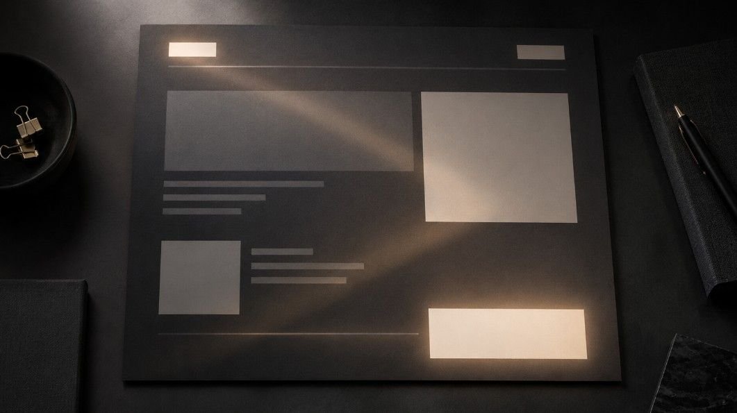
The Z-pattern layout is common on landing pages, ads, posters, and simple graphics. The eye moves from top-left to top-right, diagonally down, then across the bottom. Place the final action near that stopping point.
Mobile Scanning
Mobile users scroll quickly, so hierarchy must be sharp. Headlines should be clear, images should support the message, and buttons should be easy to tap. Many supporters discover petitions and fundraisers on phones first.
Use What Is Visual Hierarchy
This how-to section shows how to use what is visual hierarchy in real campaigns.
Start With One Message
Choose the one idea people must remember. It might be “Protect Local Libraries,” “Fund Community Bail,” or “Register Before Friday.” Make that message the largest and easiest to repeat.
Add Proof And Context
After the main message, add support such as a statistic, short story, quote, deadline, location, or impact statement. Keep this layer shorter than the headline so evidence strengthens the message instead of burying it.
Make Action Obvious
End the visual journey with a clear action. Use a button, QR code, link, form, or short instruction. “Sign The Petition” is stronger than “Learn More” because specific action creates confidence.
Visual Hierarchy Examples
Examples make the idea easier to picture and apply.
Protest Poster

A protest poster used for visual storytelling activism can lead with a large slogan, followed by a date, location, organizer name, and QR code. The slogan creates emotional impact first, while the details help people show up.
Donation Page
A donation page should show the cause, impact, and donation button early. A strong layout may begin with a headline, add one moving story, show suggested amounts, then include trust signals below.
Social Media Carousel
A carousel can use hierarchy across slides. The first slide grabs attention, the middle slides explain the problem, and the final slide gives action. This turns a complex issue into a shareable story.
Common Mistakes
Even meaningful campaigns can lose power when design choices compete with the message.
Everything Looks Equal
If every word is bold, nothing feels important. If every color screams, the audience cannot tell where to look. Let one element lead, supporting content follow, and minor details stay quiet.
The Action Is Hidden
A beautiful graphic can fail if people cannot find the next step. On a website, place action buttons at natural decision points. On a flyer, make the link or QR code readable.
Accessibility Is Forgotten
Accessible design helps more people join the cause. Use readable fonts, strong contrast, captions, alt text, descriptive links, and plain language so your message works across abilities, devices, and environments.
Frequently Asked Questions
1. What Is The Visual Hierarchy?
Visual hierarchy is the arrangement of design elements by importance. It guides the eye using size, color, contrast, typography, spacing, placement, and imagery.
2. What Is A Simple Definition Of Hierarchy?
Hierarchy means order of importance. In design, it shows what people should notice first, second, and next.
3. What Is An Example Of A Visual Hierarchy?
A campaign flyer with a large slogan, smaller event date, clear location, and visible QR code is a visual hierarchy example.
4. What Is The Visual Hierarchy In Order?
The order usually moves from main message to supporting context, then proof, details, and final action.
Let Your Message Lead
What is visual hierarchy is more than a design lesson. It is a way to make social change communication clearer, kinder, and more effective. With strong contrast, readable type, smart spacing, and focused action, your message can reach people faster and help them move with purpose.