I notice typography before I notice half the artwork. A crooked caption, a cramped speech bubble, or the wrong font can break the mood fast. That is why typography in visual storytelling matters so much. It does not just display words. It tells readers how to feel, where to look, and what kind of world they have entered.
Good typography works like quiet direction. It can whisper, warn, tease, comfort, or speed up a scene. In comics, posters, websites, film titles, social graphics, and illustrated essays, type becomes part of the story structure.
Why Typography Carries More Story Than Most People Notice
Typography is the visual arrangement of words through font choice, size, spacing, weight, alignment, color, and placement. In storytelling, those choices affect emotion and comprehension. Figma’s typography guide explains that typography supports readability, hierarchy, alignment, color contrast, and overall design quality.
I think of type as the “voice track” of a visual piece. A sharp condensed font can feel tense. A rounded handwritten font can feel friendly. A classic serif can feel literary or historic. A monospaced typewriter font can suggest evidence, records, case files, or private notes.
That is why typography in visual storytelling is not decoration. It is narrative control.
How Typography Builds Mood, Voice, and Meaning
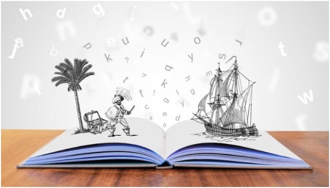
Strong visual storytelling does not rely on images alone. Words, images, color, layout, and spacing work together. When type clashes with the story’s tone, readers feel it even if they cannot explain it.
Type as Character Voice
In a comic or graphic novel, typography acts like voice acting. A calm character may need clean, rounded lettering. A nervous character may need smaller type, uneven spacing, or slightly shaky letterforms. A villain may use rigid, narrow, or angular lettering.
But subtlety matters. If every character gets a dramatic font, the page becomes noisy. I usually reserve special lettering for emotional shifts, supernatural moments, clues, or important reveals.
Type as Atmosphere
Typography can create atmosphere before a reader finishes the first sentence. A cozy mystery, for example, benefits from warm, inviting, slightly whimsical type. A horror story may use tighter spacing, heavier shadows, and harsher forms. A sci-fi interface may need geometric or modular fonts.
Google Fonts Knowledge describes typography as a way to choose and use type with purpose, not just style. That “purpose” is the real design skill. The font should support the reader’s emotional journey.
Type as Clue Direction
My favorite use of typography is clue control. In a mystery layout, one italic word, a slightly bolder phrase, or a warm burgundy highlight can guide the reader’s eye without shouting.
This connects closely with design thinking for social change, because both ask the same question: how can design guide people toward better understanding? Typography does that on a micro level. It shapes attention, reduces confusion, and makes meaning easier to follow.
Typography Hierarchy: How Readers Know Where to Look First
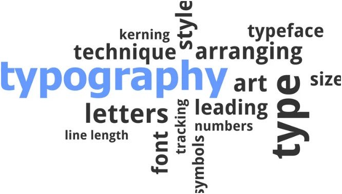
Visual hierarchy tells readers what matters first, second, and third. Without hierarchy, every word competes for attention.
Size, Weight, and Contrast
A strong typography system uses contrast with restraint. Headlines need clear size and weight. Subheadings need enough difference to signal a new section. Body text should stay comfortable and consistent.
The most common tools are font size, typeface, weight, color, capitalization, and style. These elements help organize text so readers can scan and understand information faster.
For visual stories, I use this simple test: can I understand the page order in three seconds? If not, the hierarchy needs work.
Spacing and White Space
Spacing changes pacing. Tight text feels fast, crowded, or stressful. Open spacing feels calm, thoughtful, and cinematic.
For digital readability, the W3C’s WCAG guidance says content should remain functional when users set line height to at least 1.5 times the font size, paragraph spacing to at least 2 times the font size, letter spacing to at least 0.12 times the font size, and word spacing to at least 0.16 times the font size.
That standard is useful beyond compliance. It reminds designers that breathing room is not empty space. It is part of the reading experience.
A Worked Example: Comic Book Typography for Cozy Mysteries
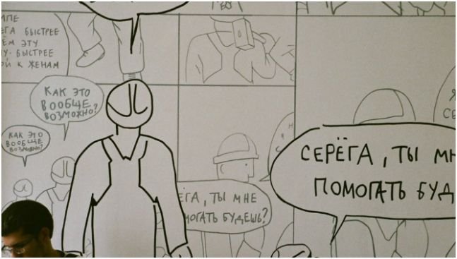
A cozy mystery comic needs a specific feeling. The reader should sense charm, curiosity, warmth, and a little suspense. The typography should help readers scan panels for hidden clues while keeping the tone gentle.
This is where typography in visual storytelling becomes practical.
Dialogue Fonts
For dialogue, I would use a clean, slightly rounded hand-lettered comic font. Harsh angles feel too aggressive. Open spacing keeps the tone conversational.
Fonts like Ames, Comic Neue, or Blambot-style hand-lettered options can fit this mood. The goal is not to look childish. The goal is to sound human, friendly, and easy to read.
Captions and Narration
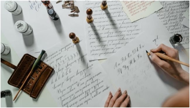
Captions can feel like the detective’s journal. A vintage typewriter style, neat cursive, or diary-like font can suggest private thoughts and case notes.
Courier New, American Typewriter, or a tidy script can work. I would avoid messy cursive because readers should never struggle to decode the narration.
Sound Effects and Word Balloons
Sound effects should match the world. In a cozy mystery, I would use soft, organic SFX: “clink” for a teacup, “creeeak” for a library door, or “purr” from the detective’s cat.
Word balloons should use smooth ovals or softly rounded rectangles. Thin borders feel calmer than thick outlines. Cream, ivory, pastel, dark chocolate, and deep charcoal can create a warmer look than stark black-on-white.
This is a small detail, but it changes the emotional temperature of the page.
Accessibility Makes Typography Better, Not Boring
Some designers treat accessibility like a limitation. I see it as a quality filter.
Accessible typography improves contrast, spacing, legibility, and comprehension. Section508.gov notes that fonts and typography affect accessibility through legibility, font size, contrast, and design best practices.
For visual storytelling, this matters because readers may view your work on phones, tablets, printed pages, or bright screens. Small text, low contrast, thin fonts, and cramped balloons can push people away.
A readable design does not kill personality. It makes personality easier to enjoy.
Common Typography Mistakes That Weaken Visual Stories
The first mistake is using too many fonts. A story usually needs one primary font, one supporting font, and one accent style. More than that can feel chaotic.
The second mistake is choosing mood over readability. A gothic font may look dramatic, but if readers pause every few words, the story loses flow.
The third mistake is ignoring mobile screens. Long captions, tiny labels, and dense text blocks can look fine on a desktop but fail on a phone.
The fourth mistake is making every clue loud. If every hint is bold, colored, or enlarged, nothing feels important. Good typography in visual storytelling guides attention without spoiling the reveal.
FAQs About Typography in Visual Storytelling
1. What is typography in visual storytelling?
Typography in visual storytelling is the use of type style, size, spacing, color, and placement to support a story. It helps shape mood, voice, pacing, hierarchy, and reader attention.
2. Why is typography important in comics and graphic novels?
Typography helps readers hear character voices, follow dialogue order, notice clues, and feel the mood of each scene. It works alongside artwork, panel flow, and color.
3. What fonts work best for visual storytelling?
The best fonts depend on the story. Rounded fonts feel friendly. Serif fonts can feel classic. Hand-lettered fonts feel personal. Typewriter fonts can suggest records, clues, or narration.
4. How does typography affect emotion?
Typography affects emotion through shape, weight, spacing, and contrast. Heavy type can feel serious. Loose spacing can feel calm. Sharp forms can feel tense or dramatic.
Final Flourish: Let the Letters Do Some Acting
Typography should never sit on the page like a label. It should perform.
When I design or review a visual story, I ask one question: do the letters feel like they belong in this world? If the answer is yes, the page becomes easier to read and harder to forget.
Use typography to set the mood, guide the eye, protect readability, and give every scene a stronger voice. Start with one page, fix the hierarchy, soften the spacing, and make the type serve the story.