

Infographics were simply a pretty way to display facts. Then I realized the best ones do something much bigger. They guide the reader through a message, build interest, explain the “why,” and leave one clear idea behind.
That is where infographic storytelling tips become useful. A strong infographic does not just show data. It turns information into a visual journey. Whether you are creating content for a blog, brand campaign, report, classroom resource, or social media post, the goal is the same: make people understand faster and care more.
What Is Infographic Storytelling?
Infographic storytelling is the process of using visuals, short copy, data, layout, and design flow to tell a clear story. Instead of placing random facts on a page, you arrange information so the reader moves from one idea to the next without confusion.
A good infographic usually has a beginning, middle, and end. The beginning introduces the topic. The middle explains the key facts or problem. The end gives a takeaway, solution, or action step.
This is why storytelling matters so much. People do not remember loose numbers as easily as they remember a clear message connected to real meaning.
Why Infographics Need a Story
A beautiful design can catch attention, but a strong story keeps people reading. Without a story, an infographic can feel like a crowded poster. With a story, it becomes easier to scan, understand, and share.
Story-driven infographics work well because they simplify complex ideas. They also help readers connect emotionally with facts. For example, a chart about food waste may be useful, but a visual story showing how one family reduces waste each week feels more relatable.
Start With One Clear Message
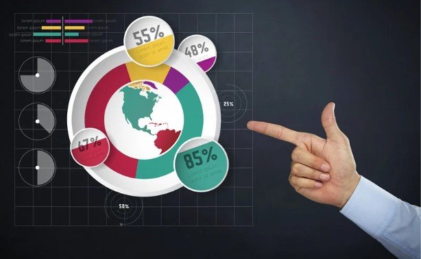
The biggest mistake I see in weak infographics is trying to say too much at once. Before choosing colors, icons, or charts, decide the one thing you want readers to remember.
Ask yourself: What should someone understand after viewing this?
Maybe your message is that remote workers need better time management. Maybe it is that small design choices can improve accessibility. Maybe it is that a brand’s sustainability efforts are making a real difference. Once the core message is clear, every visual, number, heading, and section should support it.
Know Your Audience Before You Design
Your audience affects everything. A business audience may want clean charts, clear insights, and practical takeaways. A student audience may need simpler language and more visual examples. A social media audience may prefer bold titles and quick scanning.
If your readers are beginners, avoid heavy jargon. If they are professionals, give them sharper insights. Good visual storytelling feels made for the person reading it.
Build a Beginning, Middle, and End
The best infographic stories follow a natural flow. Start with context so readers understand why the topic matters. Then move into the main facts, data, or steps. Finally, end with a takeaway that makes the message feel complete. A simple structure looks like this:
- Problem
- Cause
- Data
- Insight
- Solution
- Action
This flow works because it mirrors how people process information. They first need to know what is happening, then why it matters, then what they should do next.
Use Data to Support the Story
Data should not replace the story. It should strengthen it. Do not add statistics just because they look impressive. Choose numbers that explain the point clearly. If a statistic does not support the message, remove it.
For example, if your infographic is about visual content marketing, do not overload it with every possible marketing statistic. Select the most relevant data points, then explain what each one means in simple words. Readers should never have to guess why a number matters.
Create a Strong Visual Hierarchy

Visual hierarchy tells the reader where to look first, second, and third. This is one of the most important parts of infographic design.
Use a strong title at the top. Break the content into clear sections. Make important numbers larger. Use spacing to separate ideas. Keep icons, charts, and images aligned with the story.
Color can also guide attention, but it should not become distracting. Choose a small color palette and use contrast carefully. The goal is not to decorate the page. The goal is to make the message easier to follow.
Keep the Text Short and Useful
Infographics are not blog posts squeezed into graphic form. The copy should be short, sharp, and helpful.
Use headings that explain the point quickly. Keep supporting text to one or two short sentences. Replace long explanations with icons, charts, arrows, timelines, or comparison blocks when possible.
Short text helps readers move through the design smoothly. It also makes the infographic easier to view on mobile screens, where long paragraphs can feel overwhelming.
Choose the Right Infographic Format
Different stories need different formats. A process infographic works well when explaining steps. A timeline works best for history, progress, or change over time. A comparison infographic is useful when showing differences between two options.
A list format is good for quick tips. A data visualization format works when numbers are the main focus. A case study infographic is helpful when showing a problem, action, and result. Choosing the right format helps the story feel natural instead of forced.
Add a Human Element
Even data-heavy infographics become stronger when they include people. You can add a short example, real-world situation, customer journey, quote, or practical scenario.
For instance, an infographic about energy savings can show how a household reduces monthly bills. A design infographic can show how a small business improves website readability. These details make the message feel useful, not abstract. People connect with people, even when the topic is technical.
End With a Clear Takeaway

Every infographic should finish with purpose. Do you want the reader to learn something, change a habit, visit a page, download a resource, or share the content?
Your ending could be a short summary, a final statistic, a checklist, or a call to action. What matters is that the reader does not feel abandoned at the end. A strong final takeaway gives the whole design meaning.
Common Infographic Storytelling Mistakes to Avoid
One common mistake is starting with design before planning the message. This often leads to attractive visuals that do not say much.
Another mistake is adding too much text. If the infographic feels like a full article, it loses its visual power. Weak titles are also a problem because the title is often the first reason someone decides to keep reading.
Poor chart choices can confuse readers too. A chart should make data easier to understand, not harder. Also avoid using too many fonts, colors, icons, or visual styles in one design.
Finally, do not forget mobile readability. Many people will view your infographic on a phone, so the layout must stay clean and easy to scan.
How Infographic Storytelling Helps SEO
Infographics can support SEO when they keep people engaged, explain difficult topics clearly, and make content more shareable. A useful infographic can earn backlinks, improve time on page, and make a blog post feel more complete.
For best results, place the infographic inside a helpful article instead of publishing it alone. Add keyword-rich headings, descriptive alt text, supporting copy, and a clear introduction before the graphic. This gives search engines more context and gives readers a better experience.
Frequently Asked Questions
1. What are the best infographic storytelling tips for beginners?
Beginners should start with one clear message, understand the audience, use a simple beginning-middle-end structure, keep text short, choose the right chart type, and end with a clear takeaway.
2. What makes an infographic tell a good story?
A good infographic tells a story when every section supports one main idea. It should guide the reader smoothly from context to insight, then to a useful conclusion or action.
3. How do you start an infographic story?
Start by defining the main question your infographic should answer. Then choose the most important facts, organize them in a logical order, and plan the layout before designing.
4. Why is visual hierarchy important in infographics?
Visual hierarchy helps readers know where to look first. It uses size, spacing, color, headings, and layout to make the information easier to scan and understand.
5. What should I avoid when making an infographic?
Avoid clutter, too much text, random data, weak headings, poor contrast, confusing charts, and visuals that look nice but do not support the main message.
Final Takeaways
When I create an infographic now, I do not start with colors or icons. I start with the story. That one shift makes the whole design stronger.
A powerful infographic gives readers a reason to care, a path to follow, and a message they can remember. When the story is clear, the design becomes more than decoration. It becomes communication that works.